Here’s a chart that tells a story about my business. Before you read on or scroll, what story do you think it’s telling?

On the first day of February there was a pretty significant change, no change for the three weeks before, or the almost two weeks after, but February 1 was a massive day for me, this chart shows.
For three weeks there was zero, who can’t relate to that, then on one single calendar day everything changed for me. How much? It looks like it’s a 100% change. Amazing growth.
Here’s the wider screenshot of that graph from my accounting software.

It’s a savings account I’m not currently using, but on February the 1st, NZ sent me 1c of interest earned.
People can find themselves in your data, and by golly, you have a lot of data.
From your enquiries to your emails, bookings, and payments, there’s a story in your data.
I know there’s a solid contingent of wedding suppliers in this challenge, so I wonder what story we could tell about the change in the industry, in months or days of the weeks booked. For couples who couldn’t get married a few years ago because of gender, and now they can.
What stories can you tell, and what charts can your audience find themselves in?
How I’m creating my chart
My enquiry software (Gravity Forms on WordPress) allows me to export all of the forms I’ve been sent. So I’m exporting all contact forms and booking forms, and I just want a long list of dates.
So I export all the dates and in my spreadsheet I end up with 3916 entries of dates. There will be a few duplicates here because I imported data from enquiries and bookings, along with data from a credit card payment form I had which I bet had some data from earlier weddings which didn’t go through this booking system.
So the path I chose was a little harder than I imagined.
I had a list of dates, which I then copied into two other columns, where I changed the data type from the dd/mm/yyyy type of date to the day, day number of month, yearformat, and then enabled the categories feature of my spreadsheet software so I had data like this:

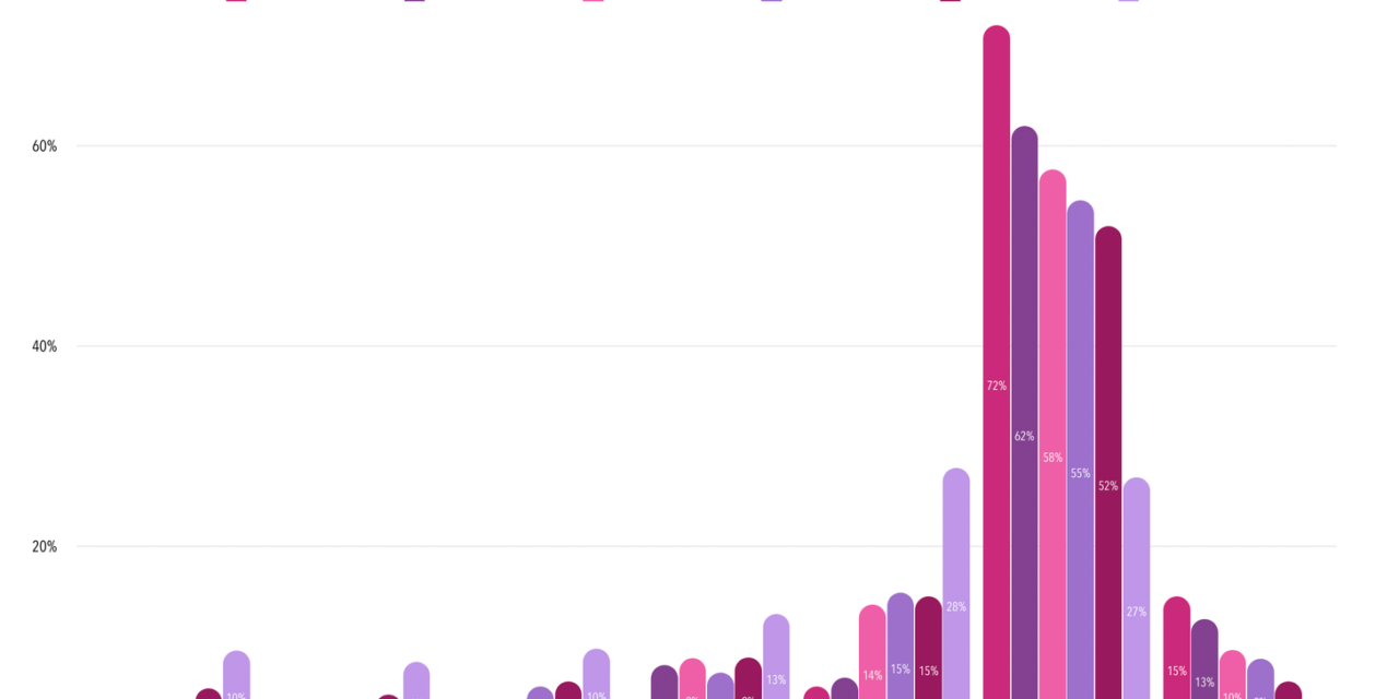
From that data I did a little copy and paste into a new spreadsheet and calculated what percentages of the people each day got, so I had a table like this:

And then in Numbers, my spreadsheet app of choice, I made this chart. The creation was instant but I diddled around with some formatting and colours.

And thus my data is visualised and my audience will have an opportunity to find themselves in the data.
If you’re choosing a Saturday wedding you’ll know you’re making a choice that’s on the decline, but if you’re deciding to get married on a Friday then you’ll feel more validated in your choice.
Find some data in your systems, and extrapolate it out to a chart, and post that baby on social media today.
And if you need some inspiration, this post inspired me to write this challenge.
Finally, here’s what I did with that chart on Facebook: