If you’re a celebrant who reads off your iPad, you might not be aware of a simple way you can help photographers and videographers.
If the ceremony is inside with lower lighting, your iPad’s screen brightness will often reflect onto your face, like this:
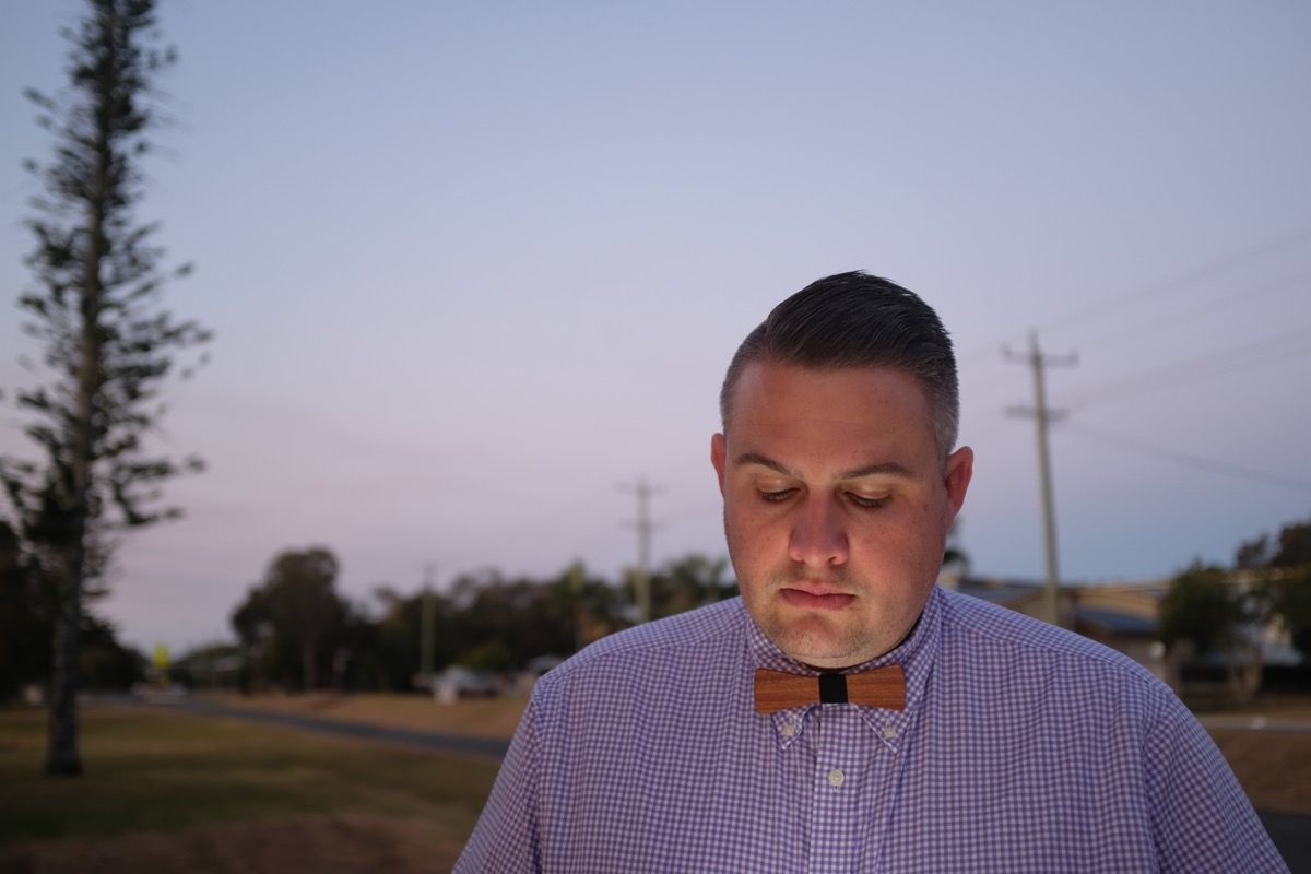
This is normal and to be expected, you do after all need to be able to read your iPad’s screen. The problem is that most lighting in a darker setting like this would be warmer coloured lighting. The normal colour from an iPad’s white screen is quite blue, instead of warm.
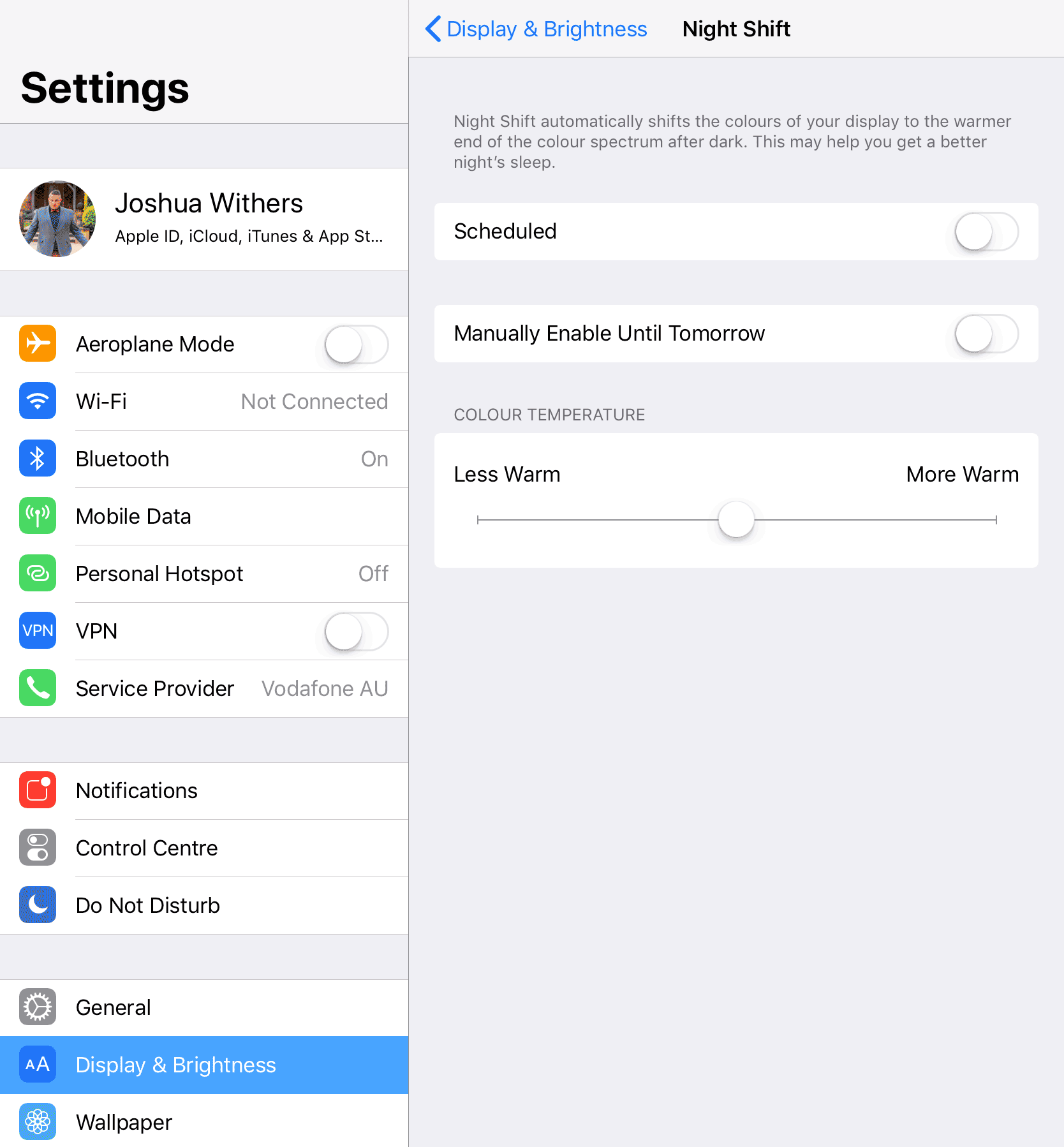
A simple flick of a switch on your iPad can make the screen warmer, like this:

Enabling this setting will make it so much easier for videographers and photographers to edit the wedding because the light on your face will be a similar colour to the rest of the lighting.
If you’re outside in full light you need not worry, and if the room is lit with cool (blue/white) colours then adjust appropriately.
The setting is called “Night shift” and it’s designed to make it easier for your iPad screen to be viewed at night.
You’ll find it in the Settings app, then “Display and Brightness” and manually enable it until tomorrow.


Good tip thanks Josh
An even more effective switch you can flick is:
General > Accessibility > Display Accommodations > Invert Colours.
It makes the page black and the text white.
HEAPS less light coming from your screen.
You shouldn’t really get any reflecting on your face at all.
That’s what I do for evening weddings 🙂
Awesome idea, and I’ll compound on this because I love what oyu’re doing with “Invert colours” but it looks ugly … so maybe we could use an app that has a “Dark mode” or “night mode”.
I use Drafts 5 for my notes and writing and it has an awesome “Dark mode”. setting.
I second Damon’s comment! I only need to wear my glasses when working with back-lit screens, but I find that using invert colours is perfect for me, as it means I don’t need glasses for a 20-minute or so the ceremony. It might not be pretty, but it works for me.
There’s another handy one in the display accomodations called reduce white point. I find that one really handy if you don’t want to go for the inverted colours.